Reasons to Try the 'Harsh' Compass Extension
CSS3 has made it easier than ever to create tons of really cool and interesting effects, especially with an open-source framework like Compass. Harsh is a Compass extension that creates CSS3 gradients with, that’s right, harsh color stops. Or subtle ones if that’s your thing. I’m glad I found it and tried it out. Here are a few reasons why.
It’s easy! Unless you’re like me and have next to no experience with CSS, but as long as you’re not, it’s totally easy! To incorporate it into an octopress blog I added the gem to the gemfile.
And, per the config.rb instructions, I required my new compass plugin like so.(gemfile) download 1 2 3 4 5 6 7 8 9 10 11 12 13 14 15 16 17 18 19
source "http://rubygems.org" group :development do gem 'rake', '~> 0.9' gem 'rack', '~> 1.4.1' gem 'jekyll', '~> 0.12' gem 'rdiscount', '~> 1.6.8' gem 'pygments.rb', '~> 0.3.4' gem 'RedCloth', '~> 4.2.9' gem 'haml', '~> 3.1.7' gem 'compass', '~> 0.12.2' gem 'rubypants', '~> 0.2.0' gem 'rb-fsevent', '~> 0.9' gem 'stringex', '~> 1.4.0' gem 'liquid', '~> 2.3.0' end gem 'sinatra', '~> 1.3.3' gem "harsh", "~> 1.0.0"Then to use it I included it in the _styles.scss file like any CSS element except with the mixin syntax.(config) download 1 2 3
# Require any additional compass plugins here. project_type = :stand_alone require "harsh"(harsh_header) download 1 2 3
header[role="banner"] {
  @include harsh($transparency: .8);
}
If you haven’t used mixins before, this is a pretty cool way to start. Mixins let you create chunks of CSS that can be easily reused. I find this especially useful in the case of gradients as they can be time-consuming to build. For instance the above header code would actually be much longer without using the harsh mixin. Seriously, like absurdly longer.
Essentially a mixin sets up a code pattern as a variable that you can then mix into the rest of your code so there’s no need to type out or ever copy paste code that you’re going to need multiple times. This significantly cuts down on the amount of code you need.(unharsh_header) download 1 2 3 4 5 6 7
header[role="banner"] { background: -webkit-gradient(linear, 65% 16%, 35% 84%, color-stop(45%, rgba(228, 136, 242, 0.2)), color-stop(45.0%, transparent)), -webkit-gradient(linear, 60% 78%, 40% 22%, color-stop(3%, rgba(1, 31, 113, 0.2)), color-stop(3.0%, transparent)), -webkit-gradient(linear, 89% 34%, 11% 66%, color-stop(65%, rgba(50, 52, 43, 0.2)), color-stop(65.0%, transparent)), -webkit-gradient(linear, 87% 71%, 13% 29%, color-stop(31%, rgba(65, 115, 22, 0.2)), color-stop(31.0%, transparent)), -webkit-gradient(linear, 25% 14%, 75% 86%, color-stop(38%, rgba(38, 189, 67, 0.2)), color-stop(38.0%, transparent)), -webkit-gradient(linear, 13% 36%, 87% 64%, color-stop(21%, rgba(27, 194, 16, 0.2)), color-stop(21.0%, transparent)), -webkit-gradient(linear, 7% 25%, 93% 75%, color-stop(59%, rgba(209, 164, 155, 0.2)), color-stop(59.0%, transparent)), -webkit-gradient(linear, 90% 86%, 10% 14%, color-stop(25%, rgba(175, 225, 97, 0.2)), color-stop(25.0%, transparent)), -webkit-gradient(linear, 18% 29%, 82% 71%, color-stop(52%, rgba(62, 145, 240, 0.2)), color-stop(52.0%, transparent)), -webkit-gradient(linear, 66% 68%, 34% 32%, color-stop(40%, rgba(193, 119, 226, 0.2)), color-stop(40.0%, transparent)), white; background: -webkit-linear-gradient(65% 16%, rgba(228, 136, 242, 0.2) 45%, transparent 45.0%), -webkit-linear-gradient(60% 78%, rgba(1, 31, 113, 0.2) 3%, transparent 3.0%), -webkit-linear-gradient(89% 34%, rgba(50, 52, 43, 0.2) 65%, transparent 65.0%), -webkit-linear-gradient(87% 71%, rgba(65, 115, 22, 0.2) 31%, transparent 31.0%), -webkit-linear-gradient(25% 14%, rgba(38, 189, 67, 0.2) 38%, transparent 38.0%), -webkit-linear-gradient(13% 36%, rgba(27, 194, 16, 0.2) 21%, transparent 21.0%), -webkit-linear-gradient(7% 25%, rgba(209, 164, 155, 0.2) 59%, transparent 59.0%), -webkit-linear-gradient(90% 86%, rgba(175, 225, 97, 0.2) 25%, transparent 25.0%), -webkit-linear-gradient(18% 29%, rgba(62, 145, 240, 0.2) 52%, transparent 52.0%), -webkit-linear-gradient(66% 68%, rgba(193, 119, 226, 0.2) 40%, transparent 40.0%), white; background: -moz-linear-gradient(65% 16%, rgba(228, 136, 242, 0.2) 45%, transparent 45.0%), -moz-linear-gradient(60% 78%, rgba(1, 31, 113, 0.2) 3%, transparent 3.0%), -moz-linear-gradient(89% 34%, rgba(50, 52, 43, 0.2) 65%, transparent 65.0%), -moz-linear-gradient(87% 71%, rgba(65, 115, 22, 0.2) 31%, transparent 31.0%), -moz-linear-gradient(25% 14%, rgba(38, 189, 67, 0.2) 38%, transparent 38.0%), -moz-linear-gradient(13% 36%, rgba(27, 194, 16, 0.2) 21%, transparent 21.0%), -moz-linear-gradient(7% 25%, rgba(209, 164, 155, 0.2) 59%, transparent 59.0%), -moz-linear-gradient(90% 86%, rgba(175, 225, 97, 0.2) 25%, transparent 25.0%), -moz-linear-gradient(18% 29%, rgba(62, 145, 240, 0.2) 52%, transparent 52.0%), -moz-linear-gradient(66% 68%, rgba(193, 119, 226, 0.2) 40%, transparent 40.0%), white; background: -o-linear-gradient(65% 16%, rgba(228, 136, 242, 0.2) 45%, transparent 45.0%), -o-linear-gradient(60% 78%, rgba(1, 31, 113, 0.2) 3%, transparent 3.0%), -o-linear-gradient(89% 34%, rgba(50, 52, 43, 0.2) 65%, transparent 65.0%), -o-linear-gradient(87% 71%, rgba(65, 115, 22, 0.2) 31%, transparent 31.0%), -o-linear-gradient(25% 14%, rgba(38, 189, 67, 0.2) 38%, transparent 38.0%), -o-linear-gradient(13% 36%, rgba(27, 194, 16, 0.2) 21%, transparent 21.0%), -o-linear-gradient(7% 25%, rgba(209, 164, 155, 0.2) 59%, transparent 59.0%), -o-linear-gradient(90% 86%, rgba(175, 225, 97, 0.2) 25%, transparent 25.0%), -o-linear-gradient(18% 29%, rgba(62, 145, 240, 0.2) 52%, transparent 52.0%), -o-linear-gradient(66% 68%, rgba(193, 119, 226, 0.2) 40%, transparent 40.0%), white; background: linear-gradient(65% 16%, rgba(228, 136, 242, 0.2) 45%, transparent 45.0%), linear-gradient(60% 78%, rgba(1, 31, 113, 0.2) 3%, transparent 3.0%), linear-gradient(89% 34%, rgba(50, 52, 43, 0.2) 65%, transparent 65.0%), linear-gradient(87% 71%, rgba(65, 115, 22, 0.2) 31%, transparent 31.0%), linear-gradient(25% 14%, rgba(38, 189, 67, 0.2) 38%, transparent 38.0%), linear-gradient(13% 36%, rgba(27, 194, 16, 0.2) 21%, transparent 21.0%), linear-gradient(7% 25%, rgba(209, 164, 155, 0.2) 59%, transparent 59.0%), linear-gradient(90% 86%, rgba(175, 225, 97, 0.2) 25%, transparent 25.0%), linear-gradient(18% 29%, rgba(62, 145, 240, 0.2) 52%, transparent 52.0%), linear-gradient(66% 68%, rgba(193, 119, 226, 0.2) 40%, transparent 40.0%), white; }The Harsh property takes a number of different attributes so you have a lot of control over the end result.
@include harsh($color, $background, $transparency, $number-of-gradients, $angle, $nuance, $nuance-strength)
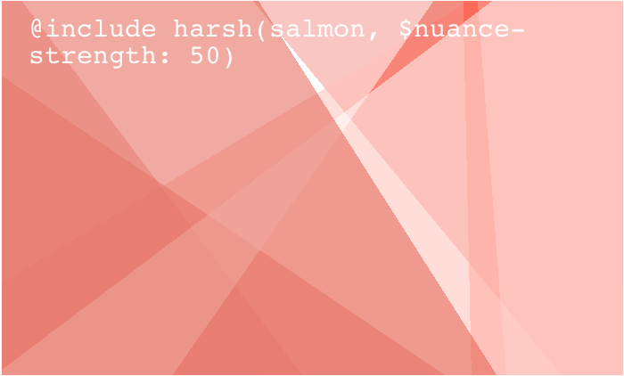
Even just using a couple of the attributes can give you something interesting.
If you don’t specify any colors the element defaults to random, which I actually prefer because there’s something kind of nice about letting the backgrounds on your blog be randomly generated.
Doesn’t it remind you of one of those drawings you made in MS Paint as a kid with all the random triangles that you filled in? But like way classier? Also, how cool is it that you can have in a couple steps something that would typiclly be pretty tedious to manually create?
I’m glad I stumbled across Harsh because I learned a lot while trying to figure it out. This process of discovery, attempted implementation, and multiple failures before success has been fundamental to my experience coding thus far. It definitely keeps things interesting!